April 25, 2017
Let’s talk about graphs
If you know me, you know I like graphs. (I’m pretty one-dimensional, I know.)
I have graphed in dozens of ways, and my preferred method for going on 2 years now has been R’s standout graphics package ggplot2. I could go on for hours about why ggplot2 is a great way to make data visuals, but I’ll spare readers familiar with ggplot the repitition and readers unfamiliar with ggplot the disgrace of describing graphics in words instead of pictures.
The only background you need to know is that ggplot2 graphics are incredibly customizable. You can display the same data in many ways, you can color your plots however you like, et cetera. Let’s dig into what goes into a custom package.
What does a ggplot2 graphic look like?
R users who load the ggplot2 package will also load some datasets we can use for graphing. We’ll focus on the diamonds dataset, which contains information on 53,940 individual diamonds.
Here’s what a ggplot graphic can look like without much customization.
ggplot(data = diamonds) +
  geom_point(aes(x = carat, y = price))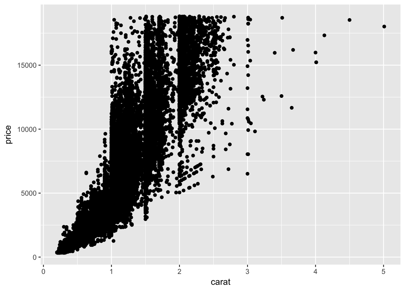
We wrote two slim lines of code, but we generated a full graphic in return. In particular,
- Each point represents the caret (x-axis) and price (y-axis) of a diamond in our dataset. (There are almost 54,000 points in this graph!)
- Our axes are labeled by default
- The plot has a grey background by default
- The gridlines (that is, the lines on the plot background) are white by default
- Noticeable on this site: The area surrounding our plot (the margin) is white by default
This is my first argument for why ggplot is so cool. We get a lot for very little.
Dressing up a ggplot2 graphic
What if we wanted to spruce this up a bit?
The labs function gives us a very easy interface for labeling our graphics.
ggplot(data = diamonds) +
  geom_point(aes(x = carat, y = price)) +
  labs(title = 'Title',
       subtitle = 'This is my subtitle. I want to fit some lines here.',
       caption = 'caption')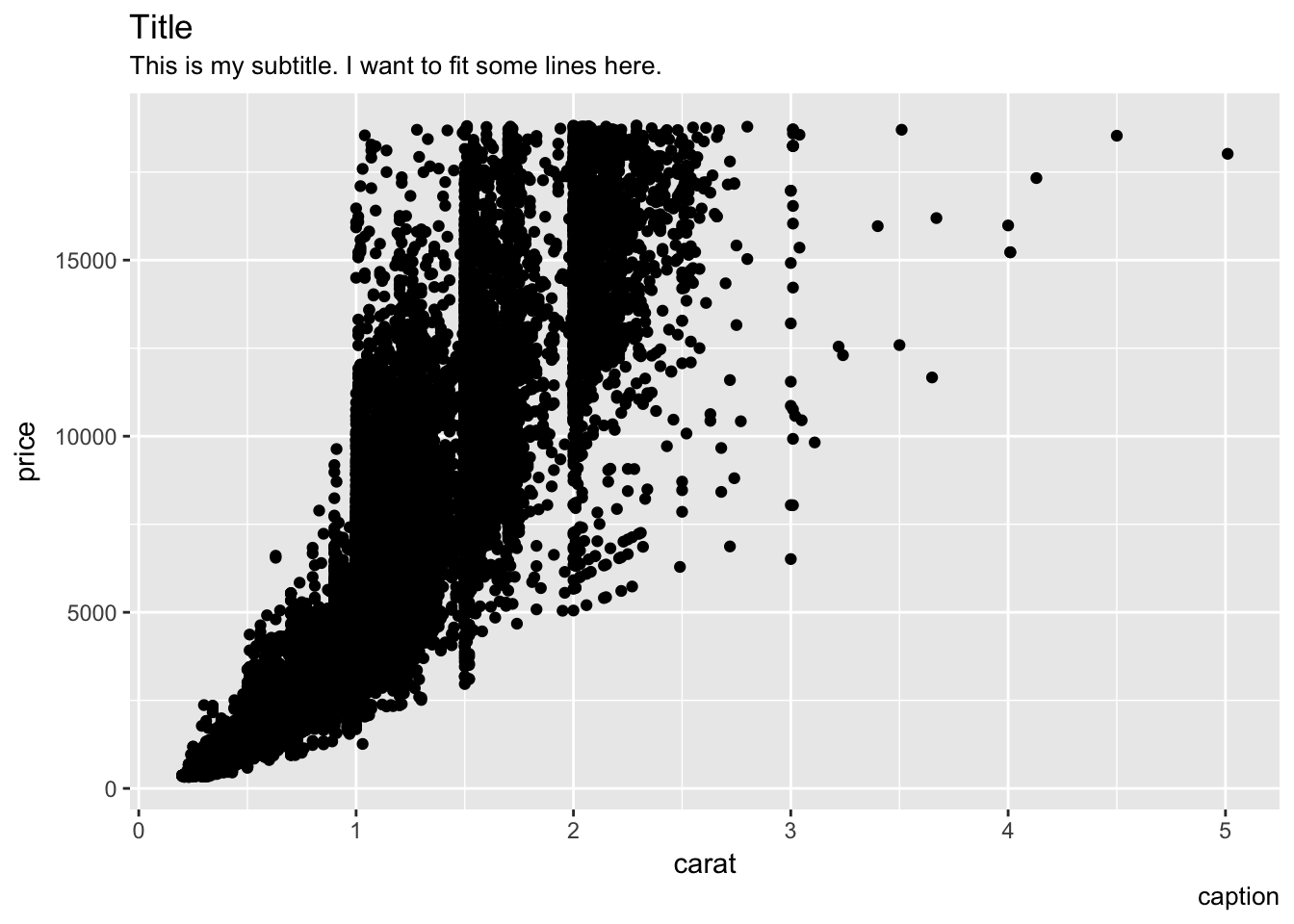
Here, we’ve added three more bits of text outside of our plot:
- A title, generally displayed above the plot
- A subtitle, generally displayed below the title
- A caption, generally displayed below the plot
Being able to spruce up graphics relatively painlessly is a huge win for ggplot2.
Adding more dimensions to our plot
In my mind, ggplot2 really shines when we want to do some more complicated visualizations. Say, for example, we wanted to start with our plots from before, but color the diamonds in the diamond dataset by the cut of the diamond. ggplot2 makes this much easier than say Microsoft Excel:
ggplot(data = diamonds) +
  geom_point(aes(x = carat, y = price, color = cut)) +
  labs(title = 'Title',
       subtitle = 'This is my subtitle. I want to fit some lines here.',
       caption = 'caption')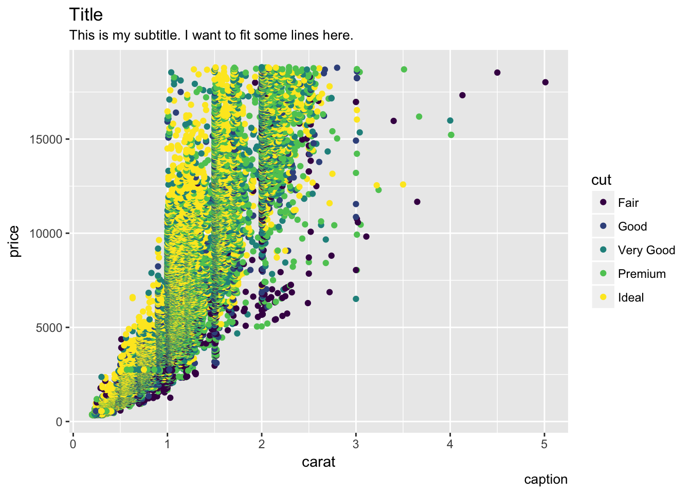
What happened here? Well,
- We colored each point by the cut of the diamond
- We were given a color palette without having to worry about it
- We were given a legend(!) with no additional work
Bringing it together
Let’s use a few more tricks to dress this plot up just a bit more.
ggplot(data = diamonds) +
  geom_point(aes(x = carat, y = price, color = cut), alpha = .4) +
  labs(title = 'The Price of Diamonds by Carat and Cut',
       subtitle = 'In general, worse-cut diamonds are cheaper',
         caption = 'Data from `diamonds` dataset in ggplot2',
color = 'Cut', x = 'Carat', y = 'Price') 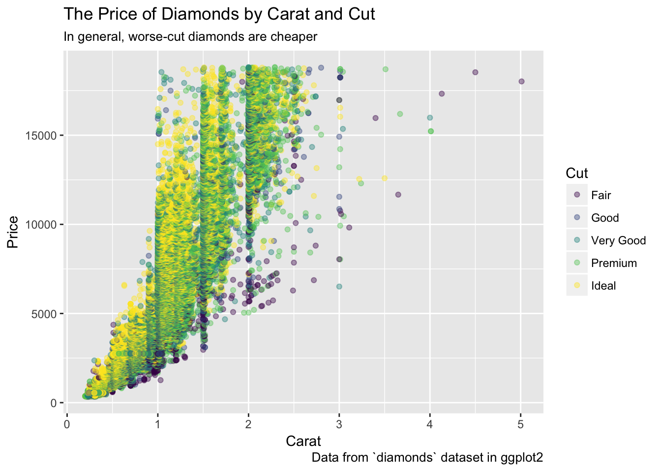
The only new argument here is alpha, which lets us make our points more transparent so that we can see through the clusters better.
Closing note: Caution with defaults
I wrote this post because I wanted to spell out in writing why I liked the philosophy of ggplot2. While that is still true, I do not like its defaults. I think the default theme (grey background, white gridlines), the default color palette, and the default labels (small Arial font on Windows; I believe Helvetica on Mac) are stylistically wrong. Wonderfully, these are all easy to fix using ggplot2’s expansive theme function. I’ll describe that more in a later post.