August 6, 2018
library(ggplot2)
library(dplyr)
library(magrittr)
library(tidyr)
They’re good charts, Brent
There are few things I like more than seeing a good political graph. Pew Research usually nails it in this department, and their graphic I saw last week was no exception. Take a look:

W - O - W. Very compelling visual with one purpose (showing that Presidential approval has always been partisan, Trump’s exceptionally so) with a bunch of fun details. Naturally I wanted to take a stab at recreating this graphic myself.
Faking data
Random number generation
If we wanted to do a faithful rendition of this graph, we’d need to hunt down the data Pew analysts used. I couldn’t find it after a cursory Google, so we’ll just make it ourselves.
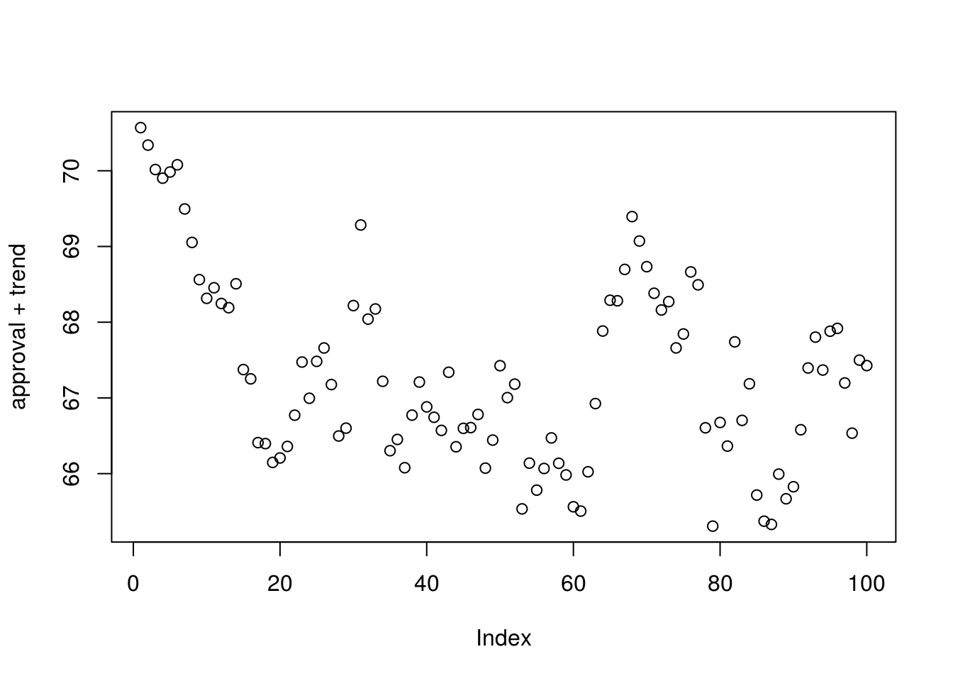
I’m going to generate fake data with a simple random walk. Let’s assume some starting point for approval and that movement from this point will both occur at evenly-spaced intervals and follow a normal distribution.
mean = 0; sd = .5; n = 100
trend = Reduce(sum, rnorm(n, mean, sd), accumulate = TRUE)

approval = 70
plot(approval + trend)
Kind of cool, right? Nothing too fancy going on here, but this should suffice for making graphs…Plus who doesn’t love an excuse to use functional programming?
Tidying up
We now have a method of generating one line of data. Per the graphic, we’ll also need to code parties and Presidents. This will be a bit easier. For the sake of this graphic, let’s fix ourselves at three Presidents and two parties.
parties = c("Republican", "Democrat")
presidents = c("Ford", "Pullman", "Freeman")
combinations = expand.grid(parties, presidents)
names(combinations) = c("party", "president")
combinations$approval = rep(runif(3, 60, 90), each = 2)
combinations
## party president approval
## 1 Republican Ford 68.08831
## 2 Democrat Ford 68.08831
## 3 Republican Pullman 82.65932
## 4 Democrat Pullman 82.65932
## 5 Republican Freeman 74.57565
## 6 Democrat Freeman 74.57565This is the start of our data. Next, we want to code whether the approval we’re observing is of members of the same party as the president. We’ll return these in pairs.
random_and_inverse = function() {
  x = rbinom(1, 1, .5)
  return(c(x, 1-x))
}

combinations$incumbent = unlist(replicate(3,
                                          random_and_inverse(),
                                          simplify = FALSE))

combinations = combinations %>%
  mutate(approval = ifelse(incumbent == 1,
                           approval,
                           100 - approval))

combinations
## party president approval incumbent
## 1 Republican Ford 68.08831 1
## 2 Democrat Ford 31.91169 0
## 3 Republican Pullman 82.65932 1
## 4 Democrat Pullman 17.34068 0
## 5 Republican Freeman 74.57565 1
## 6 Democrat Freeman 25.42435 0Next, we’ll want to generate our trendlines. We do this by repeating each row in this dataframe twenty times (representing 20 measures of approval during a President’s term). Then we subtract our generated trendlines.
df = combinations %>%
  slice(rep(1:n(), each = 20))

mean = 0; sd = 2; n = 20
trends = replicate(3, Reduce(sum, rnorm(n, mean, sd), accumulate = TRUE))
df$trend = df$approval - rep(trends, each=2)
Next, we have to make up a fake index variable for our x-axis. Only important thing here is that each President its own index.
unique.measurements = 3 * n
sequences = split(1:unique.measurements, cut(seq_along(1:unique.measurements), 3))
df$ix = unlist(rep(sequences, each = 2))
head(df)
## party president approval incumbent trend ix
## 1 Republican Ford 68.08831 1 68.77794 1
## 2 Republican Ford 68.08831 1 68.77794 2
## 3 Republican Ford 68.08831 1 67.32594 3
## 4 Republican Ford 68.08831 1 67.32594 4
## 5 Republican Ford 68.08831 1 67.72882 5
## 6 Republican Ford 68.08831 1 67.72882 6Ta-da. Tidy data ready for plotting…or just about.
Un-tidy-ing up
We actually don’t want fully tidy data here - If we want to plot the area between the two trend lines, we’ll need to split our trends data into one column for Republicans and one for Democrats.
to.plot = df %>%
  select(-incumbent, -approval) %>%
  gather(variable, value, -president, -party, -ix) %>%
  spread(party, value) %>%
  mutate(max.trend = pmax(Republican, Democrat),
         min.trend = pmin(Republican, Democrat),
         max.republican = Republican > Democrat)
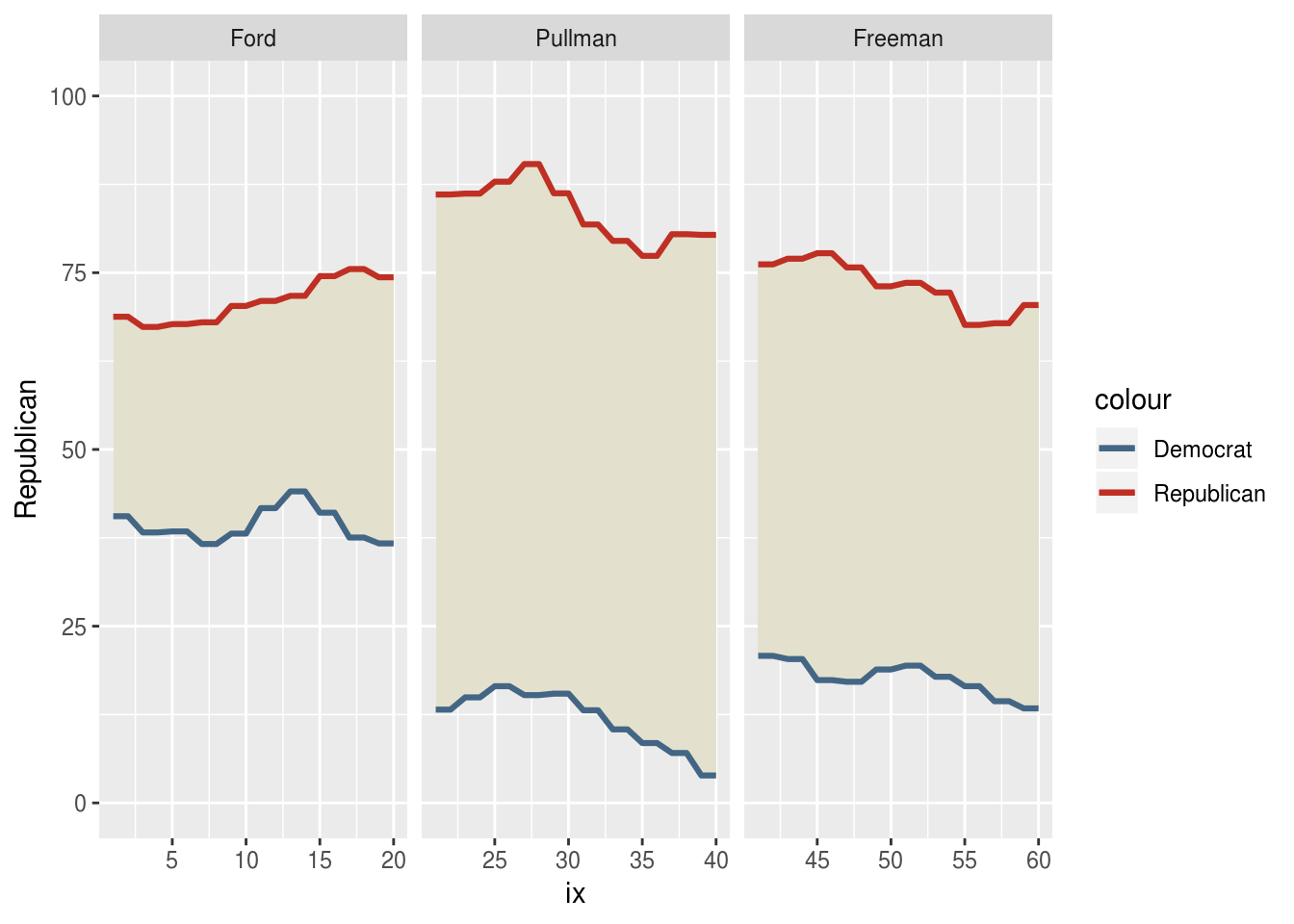
Plotting
ggplot(to.plot,
       aes(x = ix)) +
  geom_ribbon(aes(ymax = max.trend,
                  ymin = min.trend),
              fill = "#e3e1cd") +
  geom_line(aes(y = Republican,
                color = "Republican"), size = 1.1) +
  geom_line(aes(y = Democrat,
                color = "Democrat"), size = 1.1) +
  scale_y_continuous(limits = c(0, 100)) +
  scale_color_manual(values = c("Republican" = "#bf2f24",
                                "Democrat" = "#436685")) +
  facet_wrap(~president, scales = "free_x")
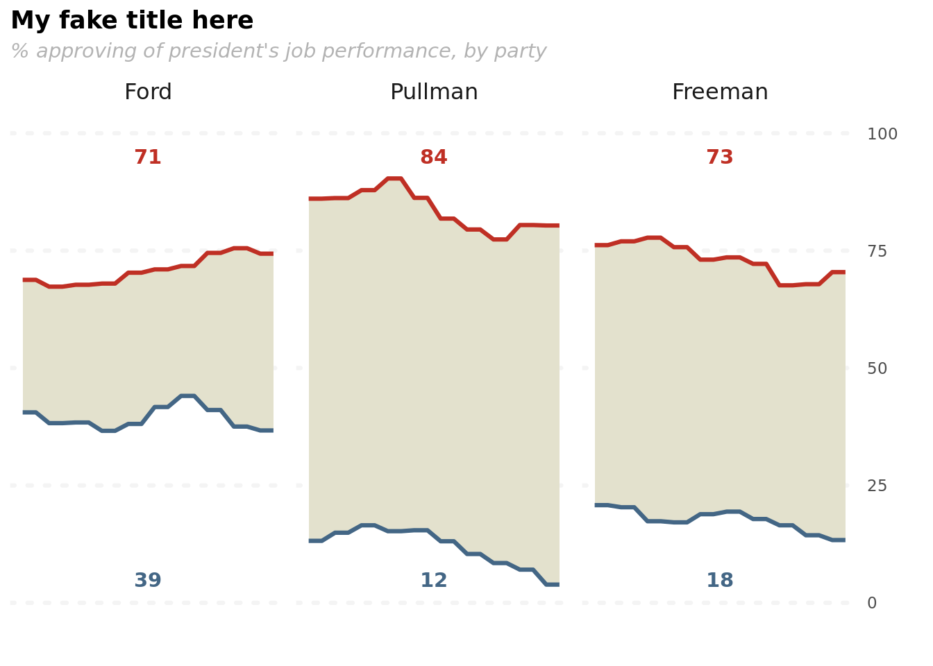
Here’s a 90% solution without any ggplot2 theme functions. I’m a pretty big fan already, but I really liked plotting the mean approval by party. To do that, I’m going to wrap this in a function call which includes summarising our data for those mean calculations.
partisanship_plot = function(df) {
  means = df %>%
      group_by(president) %>%
      summarise(Democrat = mean(Democrat),
               Republican = mean(Republican),
               ix = mean(ix)) %>%
      mutate(greater = Democrat > Republican) %>%
      gather(party, value, -ix, -president, -greater)


  ggplot(data = df,
       aes(x = ix)) +
  geom_ribbon(aes(ymax = max.trend,
                  ymin = min.trend),
              fill = "#e3e1cd") +
  geom_line(aes(y = Republican,
                color = "Republican"), size = 1.1) +
  geom_line(aes(y = Democrat,
                color = "Democrat"), size = 1.1) +
  geom_text(data = means,
            aes(label = round(value),
                color = party,
                y = ifelse(greater,
                           ifelse(party == "Democrat", 95, 5),
                           ifelse(party == "Republican", 95, 5))),
            family = "Roboto", fontface = "bold") +
  scale_y_continuous(limits = c(0, 100),
                     position = "right") +
  scale_color_manual(values = c("Republican" = "#bf2f24",
                                "Democrat" = "#436685")) +
  facet_wrap(~president, scales = "free_x") +
  labs(x = "",
       y = "",
       title = "My fake title here",
       subtitle = "% approving of president's job performance, by party") +
  guides(color = FALSE) +
  theme_bw(base_family = "Roboto") +
  theme(panel.border = element_blank(),
        plot.title = element_text(face = "bold"),
        plot.subtitle = element_text(face = "italic",
                                     color = "grey70"),
        axis.ticks = element_blank(),
        axis.text.x = element_blank(),
        strip.text = element_text(size = rel(1.1)),
        strip.background = element_blank(),
        panel.grid = element_blank(),
        panel.grid.major.y = element_line(color = "#f4f4f4",
                                          linetype = "dotted",
                                          size = 1.1))
}

partisanship_plot(to.plot)
And that’s as far as I’ll get this one. Very cool idea, not too bad to implement…once you have the data.