April 28, 2017
Isn’t this where we came in?
As I touched on in a previous post, R’s ggplot2 package is my preferred method of making visualiations (and it should be yours, too!) That said, its defaults leave much to be desired. Thankfully, we can make use of the ggplot2::theme function to spruce things up.
A quick primer on graph aesthetics
As I’ve covered before, I think about data visualization a lot. In recognition that not everyone does, I thought I could do a very high level introduction to the world of data visualization aesthetics. But first, let’s get the party started right. Good work is aspirational, and if there’s a level of ggplot-ing I want to emulate, it’s Timo Grossenbacher’s breathtaking demographics map.

Not only is this a fantastic visualization; it’s a stunning image in its own right and the code and data to produce it are available on Tmo’s website. That’s powerful. Anyway, back to the task at hand before I get too distracted.
We can think about good graphing as having two goals. First, good data visualization should accurately represent its data. Yes, you shouldn’t use your graphs to lie, but it’s also important to properly display information. This is a challenging and rich area of study, but the gist of it is visualizing the same data in different ways can cause people to understand the underlying data differently. Presenting a graph as a pie chart instead of as a bar chart will change, sometimes in a measureable way, how people understand your information. There are some general standards for how to visualize data for perception’s sake (never make “3D” Excel charts, use pie charts very sparingly, colormaps matter, et cetera). In my experience, seemingly arbitrary rules on how not to visualize information stem from this first goal: Trying to represent your data as accurately as possible.
The second goal of good graphing is one I spend more time thinking about: Making your visuals striking. Not to get all Marie Kondo in here, but there’s something pleasing on its face about seeing graph that looks intentional. This could well be an exposure effect; people who spend more time consuming visuals like breaks from tedious Excel graphics. To that degree, I’m not sure if any of the words I’m writing will make sense for someone less familiar with graphing. In the spirit of this post, let’s let the visuals do the talking. Timo wrote a fantastic post on mapping, but as for the more mundane visualizations, here’s a great graphic from Darkhorse Analytics:
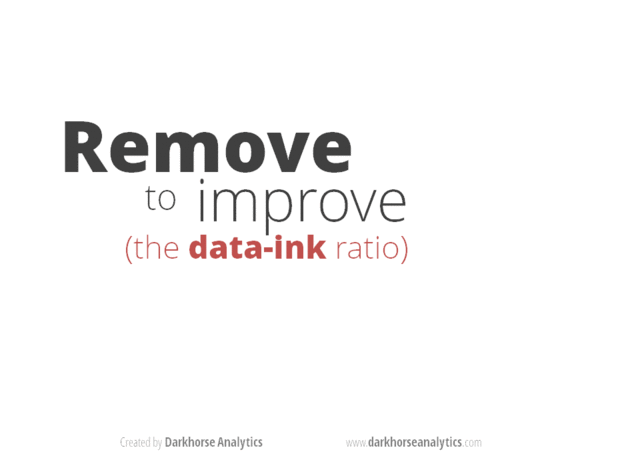
data-ink
Timo’s chart shows how beautiful you can make a ggplot with extensive customization. This gif shows how easily we can dress up any simple graphics by default. The latter is the issue we’ll hit more often, so let’s practice it first. In general, how can we make it as easy as possible for us to produce - in Darkhorse’s language - naked graphs?
Themes: One Weird Trick to ggplot
I don’t want to bulldoze over would-be graphers who prefer simplicity to customization. That said, there really is a small addition to your code that can make a big difference: Use one of ggplot2’s other themes. ggplot2 ships with a handful of themes, applying theme_grey() to graphs by default. In the spirit of minimalism, I think pretty much every theme_grey() graphic could be improved by ggplot’s theme_bw() (where “bw” means “black and white”). Let’s peak at our example from last time:
    ggplot(data = diamonds) +
      geom_point(aes(x = carat, y = price))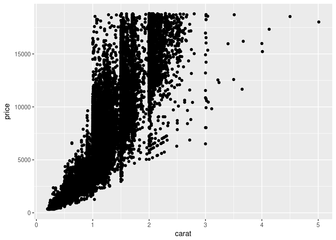
While it is still impressive we got so much (~54,000 data points visualized) out of two lines of code, we can improve this with one small addition:
    ggplot(data = diamonds) +
      geom_point(aes(x = carat, y = price)) +
      theme_bw()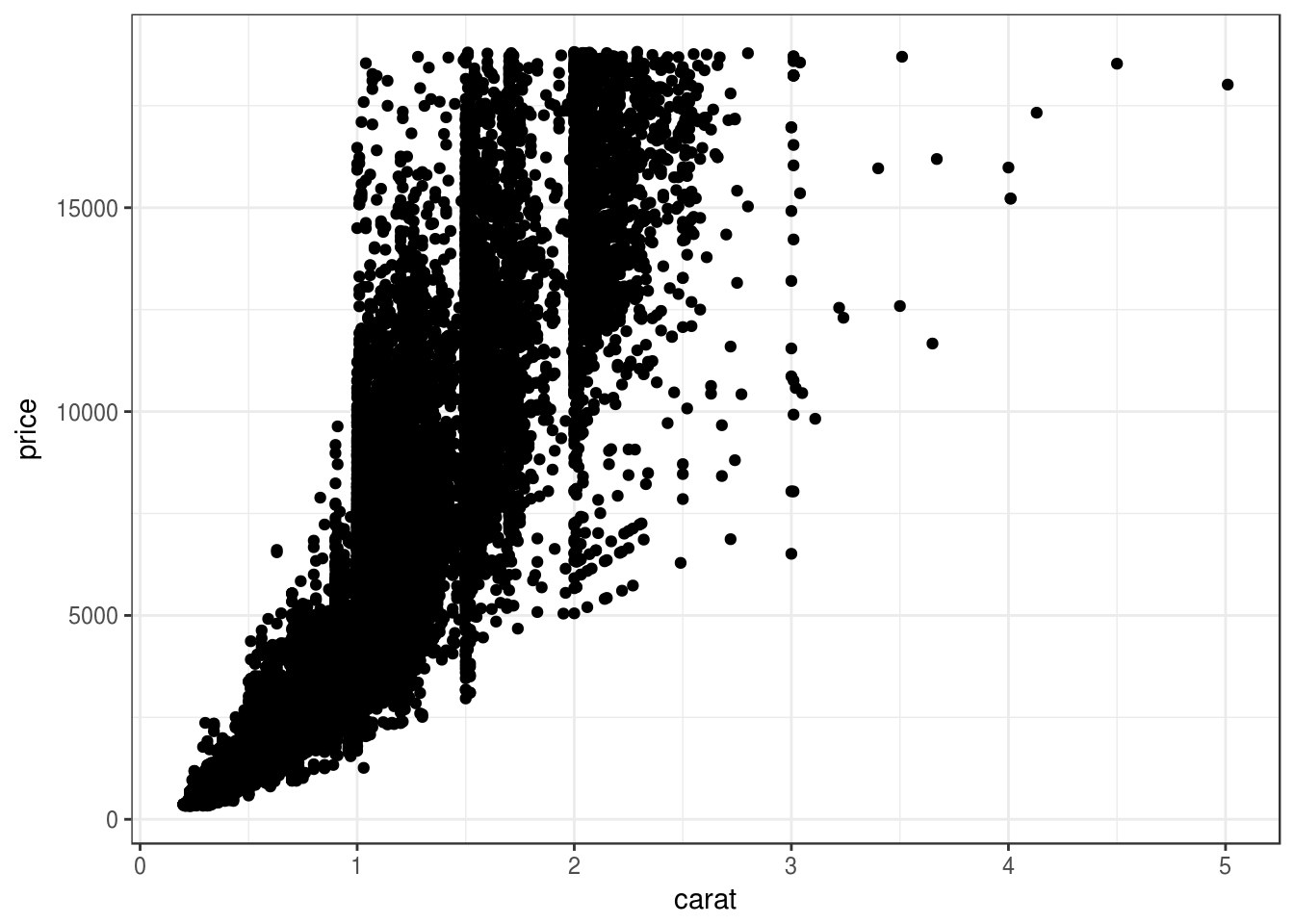
All of the data are the same, but Extremely Marie Kondo voice this is just better. But it’s not quite there – how can we do more?
Custom themes: A perfectionist’s playground
I made my first custom ggplot2 theme in undergrad in prep for a data analytics competition. The needs were pretty simple: I had to emphaisze large text as our graphs were printed and placed on posters and I had to make sure the code would work with minimal headaches on Windows machines. After a brief affair with Google’s Roboto font family, I decided on Arial and Arial Black. Here is the result:
    zzplot <- function()
      theme(panel.background = element_blank(),
            panel.grid.major = element_line(color = 'grey90'),
            panel.grid.major.x = element_blank(),
            panel.grid.minor.x = element_blank(),
            axis.line = element_line(color = '#ffffff'),
            strip.background = element_rect(),
            plot.title = element_text(size = 30, family = "Arial", face = 'bold', margin = (ggplot2::margin(b = 15))),
            axis.title = element_text(size = 20, family = "Arial", face = 'bold'),
            axis.title.y = element_text(margin = ggplot2::margin(r = 10)),
            legend.text = element_text(size = 11, family = "Arial"),
            axis.ticks = element_line(color = 'grey90'),
            axis.ticks.y = element_blank(),
            axis.text.x = element_text(margin = ggplot2::margin(t = 5)),
            axis.text = element_text(family = "Arial Black", size = 13, color = 'grey60'),
            legend.title = element_text(size = 14, family = "Arial"))

     ggplot(data = diamonds) +
      geom_point(aes(x = carat, y = price)) +
      zzplot()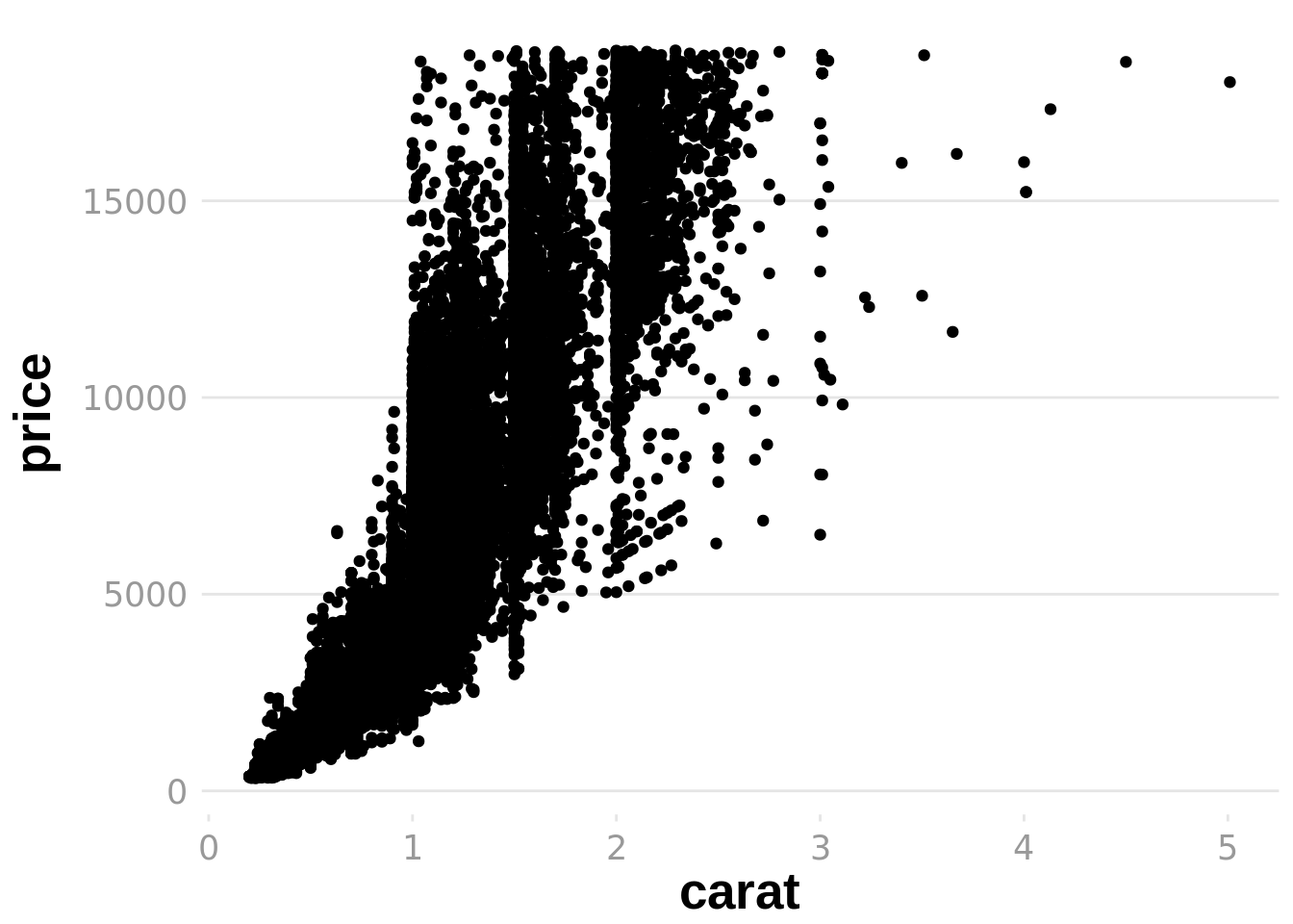
Considering I didn’t have much of an idea what I was doing, I think this turned out very well! It served its purpose. In retrospect, though, I have two qualms about continuing to graph with this theme. The first is about the aesthetics of the graph: The bold axis labels look like they were drawn by a toddler holding a fat marker with their whole fist. My second objection is about the aesthetics of the function – if you noticed, the syntax to add theme_bw to a plot was + theme_bw(), but the code to add my theme was + zzplot (no ()). What’s the deal?
Let’s follow this second objection first. One thing that is super cool about the open source movement is if I want to know how a function works I can always just look it up. In particular, a brief glance at the guts of theme_bw teaches us how to properly write a theme. Now we just need one more thing: Good fonts.
I’m going to get a little preachy: The Google Fonts website is one of the most beautiful websites I’ve ever been to. The interface is extremely helpful, they provide downloads to their fonts as well as links to embed them in websites, and it is just fun to use. Seriously worth checking out. After a bit more window shopping than I care to admit, I decided on a font pairing for my new theme: Mukta Vaani titles with Raleway labels. I fell in love with Mukta Vaani, and Raleway is a suggested pairing that’s extremely calm. (If you’re wondering what these fonts look like, I’m using them as the header and body font of this website right now.)
All said and done, here’s what I’ve got:
    theme_zz <- function(base_size = 12) {
      half_line <- base_size / 2
      theme_bw(base_size = base_size, base_family = 'Raleway') %+replace%
        theme(
          panel.background = element_blank(),
          panel.grid       = element_blank(),
          panel.border     = element_blank(),
          axis.title       = element_text(size = rel(1.2),
                                          family = 'Mukta Vaani'),
          legend.title     = element_text(size = rel(1.2),
                                          family = 'Mukta Vaani'),
          plot.title       = element_text(size = rel(2),
                                          family = 'Mukta Vaani',
                                          hjust = 0, vjust = 1,
                                          margin = margin(b = half_line * 1.4)),
          axis.ticks.x     = element_blank(),
          axis.ticks.y     = element_blank(),
          strip.background = element_blank(),
          plot.caption     = element_text(size = rel(.8), hjust = 1),
          legend.position  = 'bottom',
          legend.box.spacing = unit(0, 'cm'),
          legend.key.size  = unit(15, 'pt')
        )
      }

      ggplot(data = diamonds) +
        geom_point(aes(x = carat, y = price)) +
theme_zz() 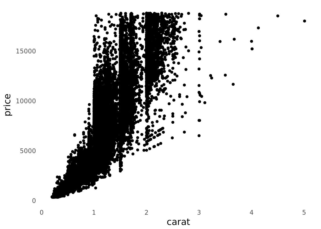
God. Damn. I’m so happy with how this turned out. Let’s throw some color and labels in to see what it can really do.
    ggplot(data = diamonds) +
      geom_point(aes(x = carat, y = price, color = cut)) +
      theme_zz() +
      labs(title = 'The Price of Diamonds by Carat and Cut'
           , x = 'Carat'
           , y = 'Price'
           , color = 'Cut'
           , subtitle = 'In general, worse-cut diamonds are cheaper'
           , caption = 'Data from "diamonds" dataset in ggplot2')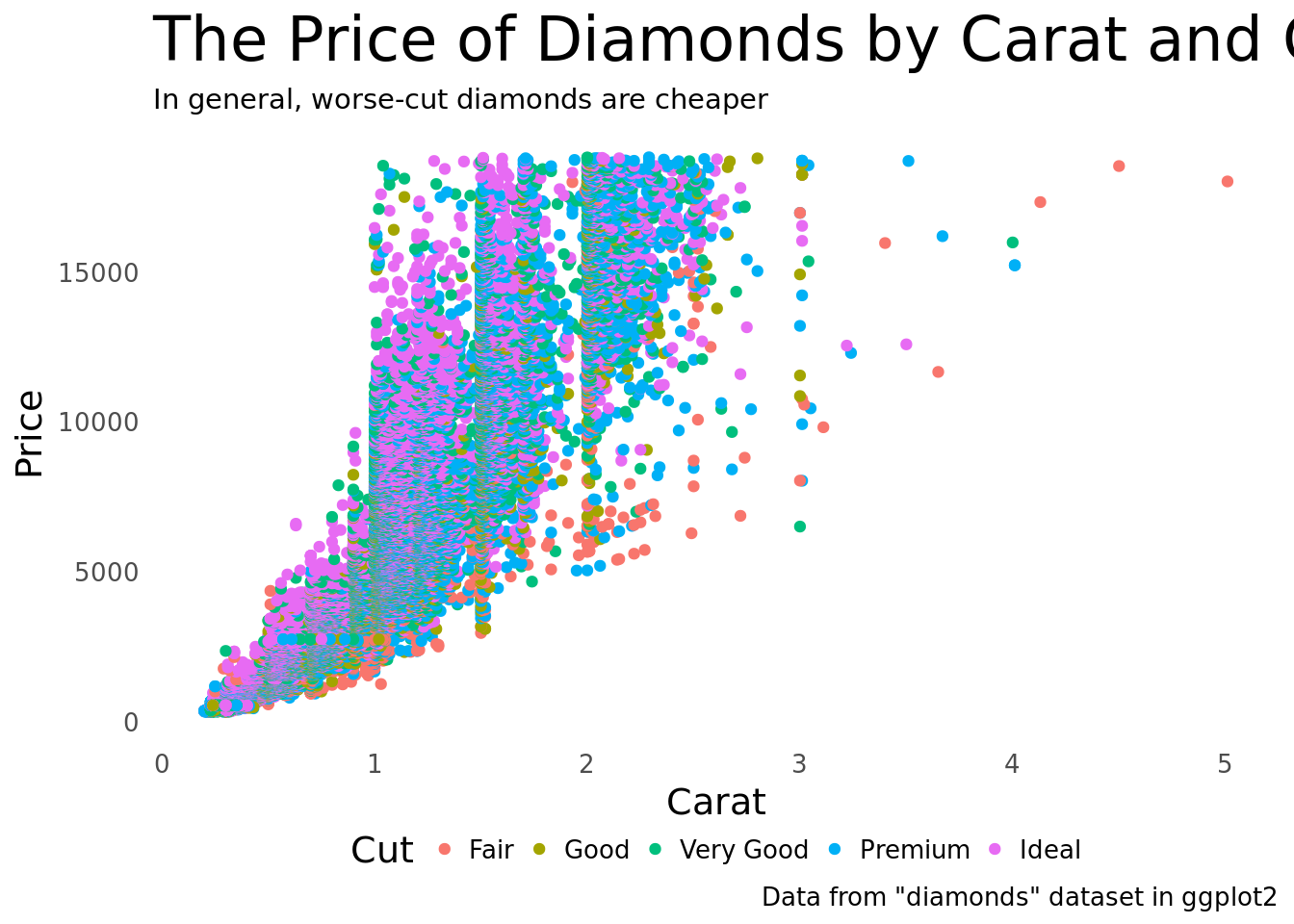
I had way too much fun with this.
Next steps
So that’s a wrap. Two things on my radar: Overwrite the default color schemes (probably just with viridis because perceptual uniformity is badass) and wrap this thing up in an R Package sometime in the next week or so. Happy graphing!